
The New Zealand data released by Barry Young can be used to prove the COVID vaccines are unsafe
Executive summary
Recently, I took another look at the New Zealand data leaked by Barry Young.
It turns out it is trivial to show that the 1 year mortality from the time of the shot is batch dependent, varying by a factor of 2 or more. That’s a huge problem for the mean mortality rates to have such a huge variation.
The other important realization (that I’m apparently the first person to point out) is that for a given age range and vaccination date, if you do a histogram of the mortality rates of the batches, if the vaccines are safe, these will form a normal distribution because of the central limit theorem. That simply doesn’t happen. So that’s another huge red flag that the vaccines are not safe.
The code and the data
The code for the New Zealand batch analysis was trivial to write. It can be found in my NewZealand Github.
Batches vary by over 2X in mortality rate, even if they are given in the same month to the same age range of people
You can’t have a 2X variation in the 1-year mortality rate for a given vaccination date and 5 year age range. That suggests that the vaccine is not safe. We can do a Fisher exact test to prove our point.

Let’s take the 80-84 year old line because there are lots of deaths there so it’s easier to show the differences between the batches are statistically significant (which should never happen if the vaccines are all safe).
Statistics for batch 34 vs. batch 38 for ages 80 to 84 given Jan 1, 2022 to Feb 28, 2022.
The Fisher matrix is (5381 2859 139 194 8573).
One-sided p-value 7.956587575710554e-18
Max likelihood estimate of the Odds ratio= 2.6265352736010104
95% Confidence Interval(low=2.091, high=3.305)
So we’re done. You can try values higher than 34 and you’ll see this wasn’t cherry picked. The 2X variation is easy to find and is statistically significant when we have enough data in the batches.
The distribution of mortality rates
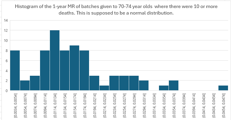
The central limit theorem guarantees that if we make a histogram of the mortality rates of each batch for a given age range, it must form a normal distribution if the vaccines are safe.
Let’s look at 70-74 year olds for all batches (I picked this because there are many batches with 10 or more deaths):
Summary
There are no published studies of the New Zealand data showing how it is consistent with a safe vaccine. That’s because the data shows otherwise.
But nobody wants to know that they were responsible for killing people. So they’ll ignore looking at the data for as long as they can get away with it.
Thank you to Barry Young for exposing this data so it can be analyzed and so we can inform people with an open mind of the harms.